GRAPHIC DESIGN
BROADWAY POSTER
This poster was a personal project I undertook as a gift for broadway actor, Rob McClure!
In designing this poster, I got to experiment with a more minimalist design style while finding creative ways to incorporate various references to several broadway musicals.
Sketching Stage
The first step in the design process was figuring out the overall composition of the piece. I wanted the various elements of the design to lead and direct the eye around the poster and not just fall flat in one area.
After creating a list of visual references for each musical I wanted to incorporate into the design, I began sketching out different placements of the elements on a very small scale, seeing which arrangement was most interesting and readable.

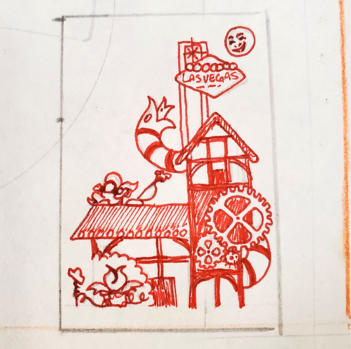
Final Thumbnail
After some deliberation, and getting some second opinions from friends, I decided to move forward with the composition shown below. I really enjoyed the triangular silhouette of the design, drawing the eye up towards the moon in the top right corner, and then flowing back down to Audrey II and the other references scattered around The Globe Theater.
There are several visual elements that I did not draw out here, but which would come into play in the next step: clean-up!

Digital Clean-Up
Bringing the tiny pen sketch into Procreate, I began the process of cleaning up the design and building the graphic shapes that would make up the composition.
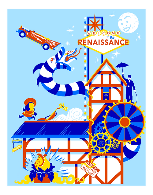
With color being my favorite part of the artistic process, I had a lot of fun choosing the palette for the piece. I wanted to capture the feel of retro/googie era graphic design and architecture, so decided that simple primaries would be a good choice.

Final Print
After adding in a few more details that did not make it into the original thumbnail, the design was finally complete! I took the file to my local print shop and had the poster printed on matte cardstock with a 1.5" mat border added to make the print pop. (See photos of the physical print on my Instagram.)
Taking on this personal project was made extra special by having a tangible product to present as a gift at the end. I look forward to exploring this style of retro poster design further in the future!
